1. In what ways does your media product use, develop or challenge forms and conventions of real media products?
Whilst planning my media products, I decided to directly address the conventions of real psychological horror/crime products by both subverting and adhering to these stereotypical features.

Horror films generally portray a fight between ‘good’ and ‘evil,’ the outcome usually being that the victim of the film survives, such as in horror hits such as
'Blue Velvet' and
'The Shining'. The reason for this is because films generally have a
moral narrative, i.e. a story of good overriding evil, so that society has a better perception of themselves. Moreover, films are extremely influential to their consumers, so the producers probably did not want the products to be too violent. This may also be because of the desensitisation theory, which states that the audience is exposed to such a large amount of violence in the media, that it no longer has strong emotional effects on the individuals involved.
 |
| 'Evil' |
 |
| 'Good' |
Following on from this, I believe I have used conventional props and sartorial codes so as to distinguish between the 'good' and 'evil' characters to my advantage, so that the audience can follow the story easily: whilst 'Claudia,' the mentally ill teacher, is wearing a black cloak - a stereotypical symbol of evil, especially the colour - 'Ellie,' the abused school student is wearing a red uniform, symbolising innocence. Although red is generally used to symbolise danger or passion, in this case, I decided to use it as in
Little Red Riding Hood, i.e. as a child-like figure, who is unaware of any dangers she may encounter in school. I also wished to use this colour because, in the earlier versions of
Little Red Riding Hood, the girl escapes without any help from a male figure (or any figure, for that matter).
Challenge
Teaser trailers generally use either a
direct mode of address or an
indirect mode of address. However, I decided to use both forms in my main product in order to interact and captivate the audience.
 |
| Newsreader - direct mode of address |
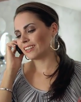
In order to create a sense of realism and urgency, I decided to include a newsreader scene whereby the actor looks directly into the camera. I believe it also gave the newsreader an air of authority which further made the teaser trailer more realistic. This adhered to the conventions of a real media teaser trailer because it grabs the audience's attention by adding a 'serious' element to the storyline, as in
'Quarantine'.
 |
| 'Claudia' - direct mode of address |
I also used direct mode of address at the end of the teaser trailer in the main character's laughing scene (as pictured). I believe this was effective in that it made the audience feel on edge and victimised, thus creating a further sense of empathy towards 'Ellie,' whilst 'teasing' the onlookers so they are more inclined to watch the film. Moreover, I used a low angle shot so that 'Claudia' would appear powerful and in control, whilst the audience feel uncomfortable and belittled.
In addition to this, whilst I the majority of my scenes would have appeared in the film, 'Aberration,' I wished to use one which would not feature in the end product. The reason for this was because most films such as
'The Da Vinci Code',
'Trainspotting' and
'The Shining' utilise this technique.
Through the portrayal of my victim, 'Ellie,' I was able to subvert the stereotypically 'dumb' and 'ditzy' woman who generally plays the roles of the innocent (as in
The Human Centipede, pictured right) by creating a character who appears studious and focused on her studies ('I have to see Miss about the work, I don't understand what we have to do'), in comparison to one who leads a glamorous lifestyle. I also chose a young, black actress so as to break free of conventions. In the media, it is said that "'blacks' or other ethnic minorities are the 'natural' cause of problems in race relations," therefore would generally be portrayed as either the 'slave figure,' 'native figure' or 'clown or entertainer.' Through my portrayal of 'Ellie,' I wished to subvert these views, so as to shock the audience, whilst attempting to change the views of the audience with regards to the 'correct' way of viewing particular members of society.

Rather than my main character being the 'hero' of the plot (in 'Aberration,' it would be 'Ellie'), I decided to instead make the protagonist the 'villain' or 'anti-hero.' (i.e. 'Claudia'). I did this by using point of view shots from 'Claudia's perspective as she abused 'Ellie,' which also meant that I gave the audience a larger chance of seeing 'Ellie's scared, distraught reactions in the teaser trailer. Personally, I believe this was a much better, more interesting, approach because the repercussions of 'Claudia's actions were more powerful with close ups of the 'victim' character. I also think the fact that 'Ellie' looks directly into the camera with these point of view shots means that there is more interaction between the audience and the film's characters.
Developed
Another way in which I was able to use codes and conventions to my advantage was through the
title of my production. I believe that in this instance, I have developed the typical horror film's title: movies like
A Tale of Two Sisters and
Mirrors utilise extremely simple fonts, perhaps so that the attention of the audience is directed towards the main picture of the poster. However, in both my poster and teaser trailer, I used a font which appeared to have some parts of the letters covered in blood, so as to create a blood spattered effect similar to
Saw's. I also decided to substitute the 't' in 'Aberration' for an upside down cross, which has become a sign for the devil and hell, thus telling the audience almost immediately that the film is of the horror genre. So, whilst I have used symbols which are typical of the horror genre, I decided to also use fonts which are generally not seen on posters, yet tell the audience more about the type of film which is being advertised.

In 'Aberration's teaser trailer, I wished to create a dark, horrifying atmosphere so that it would be more gripping for the audience, which would probably lead to a larger amount of people watching the film. I feel that I succeeded in doing so by using little to no lighting, especially in the scenes with 'Ellie' in the office. Although I had the option to use the night vision capability on the Sony HDR camera I was using, I instead opted for a more realistic approach of using natural lighting for my production. I feel that this would scare my audience more effectively, because it was playing on a very common fear (i.e. Nyctophobia). In addition to this, when I was unable to adapt the lighting of the setting in which I was filming, I edited the clips I wished to darken by using Premiere Pro, so that overall, a darker, more mysterious effect was created. Similar to
Buried, I wanted to accentuate the absence of light by using none of the camera's additional features, whilst still being able to present to the audience the victim's terror.
Overall, I believe that, for the vast majority of the time, I adhered to the codes and conventions of real media products. However, in order to make my own text stand out, I attempted to both develop and challenge the audience's expectations. I feel that I have succeeded in doing so.
 Horror films generally portray a fight between ‘good’ and ‘evil,’ the outcome usually being that the victim of the film survives, such as in horror hits such as 'Blue Velvet' and 'The Shining'. The reason for this is because films generally have a moral narrative, i.e. a story of good overriding evil, so that society has a better perception of themselves. Moreover, films are extremely influential to their consumers, so the producers probably did not want the products to be too violent. This may also be because of the desensitisation theory, which states that the audience is exposed to such a large amount of violence in the media, that it no longer has strong emotional effects on the individuals involved.


 In 'Aberration's teaser trailer, I wished to create a dark, horrifying atmosphere so that it would be more gripping for the audience, which would probably lead to a larger amount of people watching the film. I feel that I succeeded in doing so by using little to no lighting, especially in the scenes with 'Ellie' in the office. Although I had the option to use the night vision capability on the Sony HDR camera I was using, I instead opted for a more realistic approach of using natural lighting for my production. I feel that this would scare my audience more effectively, because it was playing on a very common fear (i.e. Nyctophobia). In addition to this, when I was unable to adapt the lighting of the setting in which I was filming, I edited the clips I wished to darken by using Premiere Pro, so that overall, a darker, more mysterious effect was created. Similar to Buried, I wanted to accentuate the absence of light by using none of the camera's additional features, whilst still being able to present to the audience the victim's terror.
No comments:
Post a Comment